
When it comes to data analysis, there is always a saying: “one picture worths a thousand words.”. Visualization is an essential and effective way of data exploration and usually as our first step of understanding the raw data. In Python, there are a lot of visualization libraries. For python dataframe, it has plenty of built-in plotting methods: line, bar, barh, hist, box, kde, density, area, pie, scatter and hexbin.
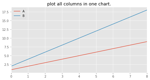
The quickest way to visualize all the columns data in a dataframe can be achieved by simply call: df.plot(). For example:
df = pd.DataFrame({‘A’:np.arange(1,10),’B’:2*np.arange(1,10)})
df.plot(title = ‘plot all columns in one chart.’)
But a lot of times we want each feature plotted on a separate chart due to the complex of data. It will help us disentangle the dataset.
It turns out that there is a simple trick to play with in df.plot, using ‘subplot = True’.
df.plot(figsize = (8,4), subplots=True, layout = (2,1), title = ‘plot all columns in seperate chart’);
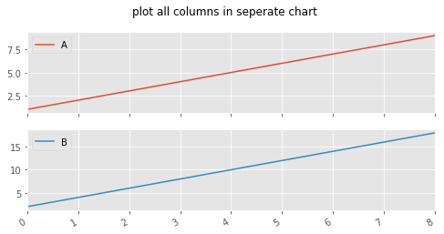
That’s it. Simple but effective. You can change the layout by playing with the layout tupple input.
Hope you find it helpful too.
